Making a Chorizo Comic Page
Yo champs.
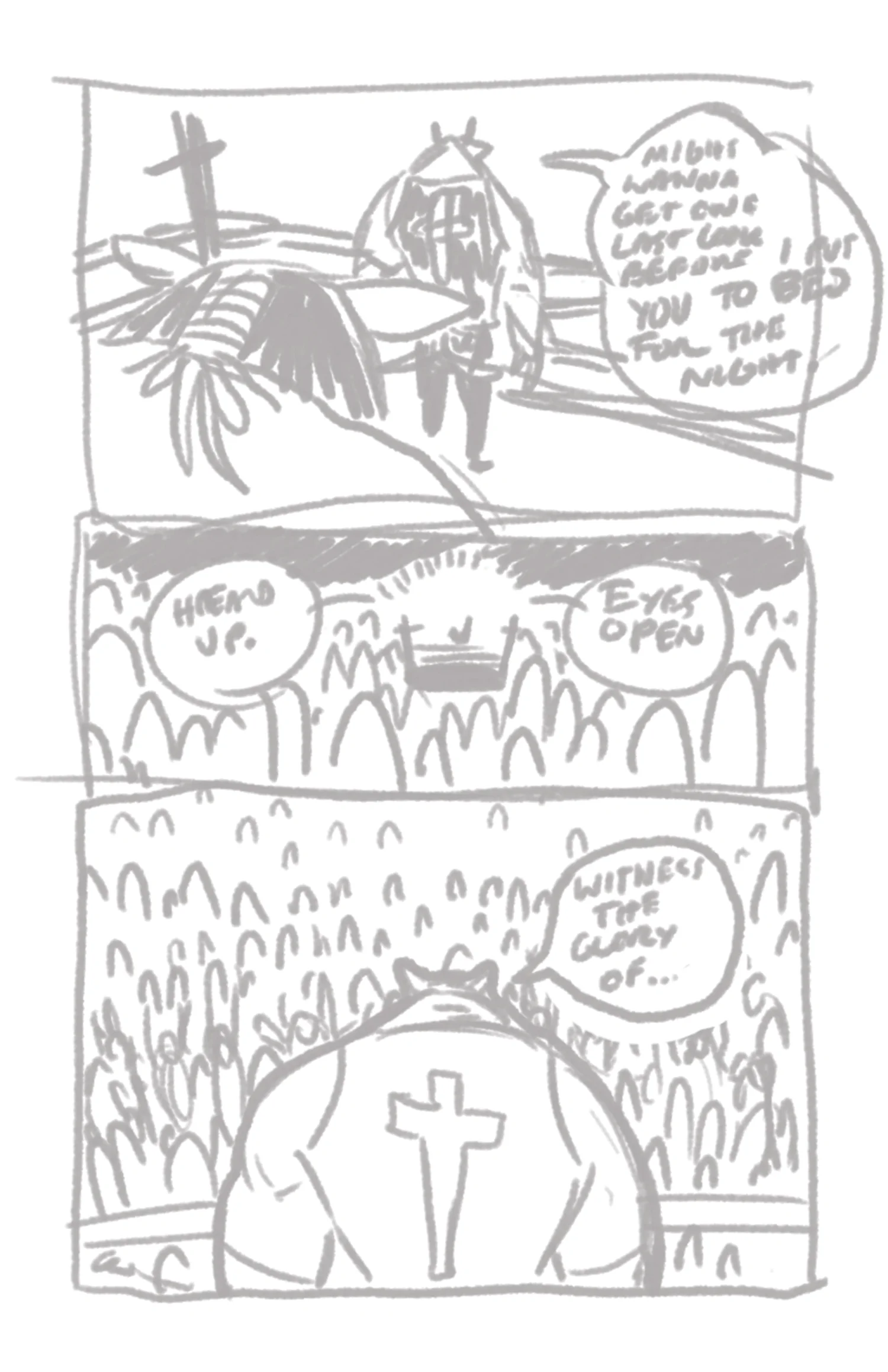
I'm working hard at the first issue, and figured I'll share some process shots along the way. My style for drawing the page is a little loose, and easier demonstrated with visuals. Generally it goes:
1. Thumbnails
2. Rough Layouts
3. Pencils
4. Inks (usually foreground)
5. Letters & Bubbles
6. Colors & Backgrounds
I try to stick to that order, but I tend to go back and forth between inking, lettering, and coloring in no particular order until the page feels right. Check it out!

Rough Layout
This is basically where I fuck around and just trying to figure out where things will land, and the flow of the bubbles.

Still Rough
From this point, I try to tighten up the concept a little bit. Here you'll see me trying out different lines that the characters are speaking. I have a tendency to improv half of what ends up on the final page while drawing it.

Pencils
I call these pencils, but really they can be anything. Chorizo is made digitally, all on the Wacom Cintiq, so I use marker type brushes for my pencil layer. The only consistent thing about this part for me is that I like using red and blue in combination, tightening the lines as I go (which are still super loose).

Inks
Probably the hardest part. My style for this book is pretty fast and loose, but the lack of detail in my pencils means I'm also improving a lot of the inks. Getting things to feel right feels tough here.
Also, I use a brush that's a little oversized intentionally, just so that I don't zoom and adjust tiny changes. I prefer to have a final look that feels like it was made with a really old brush or nib pen.

Letters
This part is pretty easy since I'm using an actual font face. I bought Hundred Watts from Blambot, which I use exclusively for Chorizo. The only part that gets tough is sizing it right.
I find that at 300dpi with the font Hundred Watts, a font size of 16pt and a line spacing of 14pt looks great.

Flat Colors (sort of)
I treat this part a little bit more like painting that filling in colors. This is where the page starts to really feel alive to me, and where I try to add a lot of the emotion.
In this issue, I'm targeting warm colors specifically. Arma is in mostly oranges, and Chorizo is in reds, while the surrounding areas are generally in yellow, with the referee being a stark blue to separate the two.

Shadow & Highlights
I didn't realize I had so many steps in this! This might be my favorite part, because it feels like I'm cheating. Personally, I don't feel that my inks are as strong unless they're supported by good color and even better lighting.
That's where the highlights and shadows come in, making the characters feel like they're actually standing in a real place.

Grayscale
Showing in grayscale to see how it pops either way. I probably could've adjusted Arma in a way that popped more from the crowd, but it's okay in color to keep it as is.

Painting
I just liked how this looked, and threw it in here without the inks as a bonus.

Final Colors
Here you'll see I added some color to the background for depth. This helps to make the action focused on the foreground and try to highlight the wrestling match, while also adding some bonus crowd goofs that don't feel too in your face.
That's it! I'm still trying out new methods, but that's pretty much how I make a page.
Let me know what you think!
